Large-Format Printing Success: Tips for Signage, Banners, and Graphics

Large-format printing is an unmatched titan in grabbing attention—when done right.
The effectiveness of large-format graphics is as much about the message as it is about the medium. Every detail, from font size to material type, can impact how your message is received and perceived.
From business signage and banners to wall and window graphics, we’ve compiled our top tips to ensure your next project achieves the “wow factor” that large-format printing is known for.
- Large-Format Printing Tips for Maximum Visibility
- Understanding Material Choices in Large-Format Printing
- Color Consistency and Accuracy in Large-Format Printing
Large-Format Printing Tips for Maximum Visibility
When planning a large-format printing project, the viewing distance is crucial. It influences every decision, from the design to how the final product will be used.
One of the most important considerations for maximum visibility is deciding on the best font size based on the viewing distance. Generally speaking, it's best to use at least one inch of letter height for every 10 feet of viewing distance. For example, a sign seen from 150 feet away needs letters at least 15 inches tall.
However, this is just a starting point. For optimal readability, consult with your printing partner. They'll use a "legibility index" to determine the ideal font size, style, spacing, contrast, and layout.
Since each type of large-format printing requires a unique approach to ensure optimal visibility, here are additional tips to consider.
Business Signage
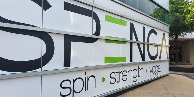
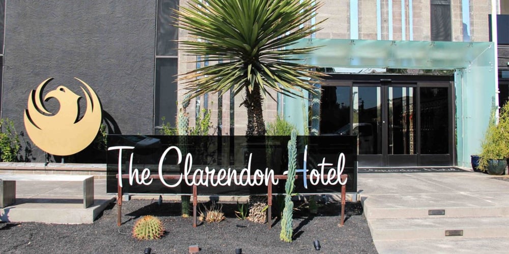
When choosing colors for your sign, consider its location, including the background and surrounding area, to prevent it from blending in. The effectiveness of any type of sign is influenced by how easily it can be read. For maximum impact, ensure the main message of an outdoor sign is concise, ideally seven words or fewer.
>>> Related Resource: Outdoor Signage: 12 Tips for the Best Color, Design, and Font
Window Graphics
 Choose opaque materials for your text and key design elements for optimal visibility against a window's clear backdrop.
This effectively shields against visual noise from the outside, ensuring your message pops and remains readable.
You may want to consider applying a polarized film to reduce the glare in windows that receive direct sunlight.
This minimizes the glare and enhances the vibrancy and definition of your window graphics, making them more striking and clear from the outside.
You might also consider two-sided window graphics with different messaging inside versus outdoors. Perforated window clings are also available, which can advertise your business from the outside and provide window tinting on the inside.
Wall Graphics
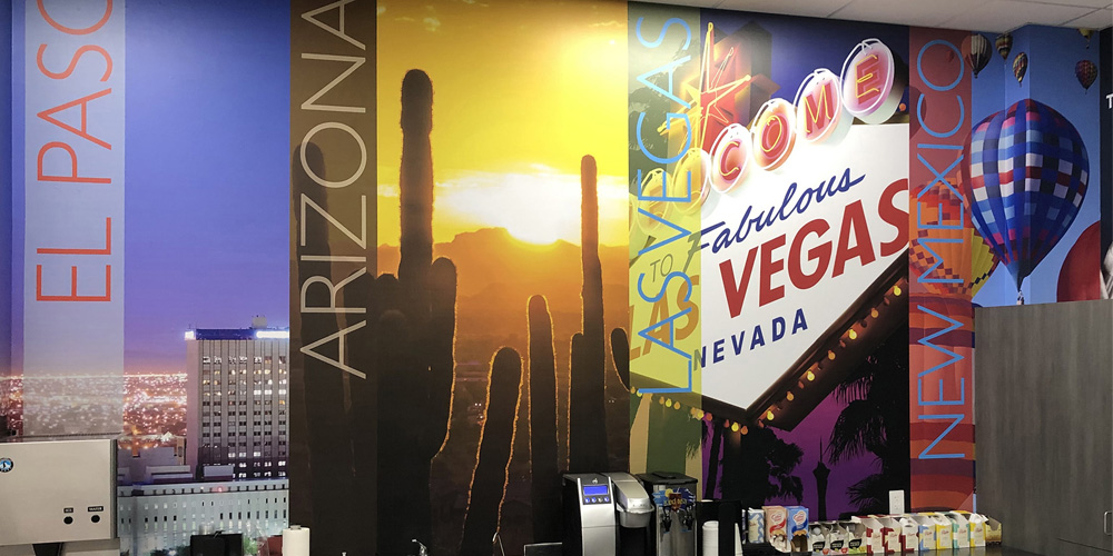
When designing wall graphics for large or elongated areas, like hallways or building exteriors, consider how much wall space the graphic should cover to stand out at the primary viewing distances.
 For example, a vertically oriented graphic in a lengthy corridor often makes a bigger splash, aligning perfectly with the viewer’s natural line of sight.
Lighting also plays an important role in how wall graphics are perceived.
Different lighting types—natural, fluorescent, LED—can dramatically alter how colors appear.
Fluorescent lights, for instance, might make some colors look faded.
It's often best to use a highly saturated color for wall graphics to ensure it's vibrant and visible in all lighting conditions.
Banners
It's crucial that banners, especially those hung in open spaces or on streets, are readable from multiple viewing angles.

If the banner will be viewed from both sides, use double-sided printing. Ensure that text alignment and spacing account for viewing from acute angles. This is especially important for outdoor banners subjected to diverse viewing conditions.
Understanding Material Choices in Large-Format Printing
Understanding how a material interacts when exposed to different environments, lighting conditions, and printer inks is key to successful large-format printing projects.
For example, rough textures like those found on exterior wall surfaces can diffuse light, which softens colors and reduces the clarity of details. In contrast, smoother substrates like glass or vinyl will provide a more direct light path (this helps enhance sharpness and color vibrancy).
Another example involves the use of glossy materials. While they can enhance color vibrancy, it's important to understand that they might introduce glare under certain lighting conditions. On the other hand, matte finishes can help to reduce undesirable glare, but they have a propensity to mute the fidelity of colors.
Here are some additional tips to help you understand which materials are best suited for various large-format printing projects.
Business Signage
Business signage often requires careful thought regarding how it will withstand environmental conditions. For outdoor signage, it’s important to use UV-resistant materials that are specifically designed to resist degradation from exposure to sunlight and will significantly extend the lifespan of your signs.
For any type of indoor signage, consider how it will look under different lighting conditions. Aesthetic elements such as gloss levels and textures can be difficult to read under too much or too little indoor lighting.
Window Graphics
Let’s be clear: understanding the difference between opaque and translucent materials can be a bit confusing.
Opaque materials completely block light, providing a solid and vivid display that ensures designs are visible without any light interference.
This makes them ideal for bold graphics that need to stand out against a clear view.
On the other hand, translucent materials allow some light to pass through, which can create dynamic visual effects depending on the lighting conditions but may also affect the sharpness and color perception of your design.
When choosing between these materials, consider how much visibility you need through the decal and how the ambient light will interact with the colors of your design. Also, for opaque decals, adding a white backing can further enhance visibility by preventing any light from diluting the impact of your graphic.
Wall Graphics
First and foremost, the best material for wall graphics depends on whether they will be indoors or outdoors. High-grade vinyl is commonly used for outdoor wall graphics to prevent them from fading. Additionally, a protective laminate is frequently used to extend the lifespan and durability of the wall graphic.
In addition to material considerations, certain types of ink are better suited for outdoor wall graphics. UV-curable inks, for example, are often the best choice for large-scale outdoor graphics since they bond well to different surfaces and offer excellent resistance to fading.
Indoor wall graphics are most commonly made from materials like vinyl, foam core, plastic, acrylics, or metal. However, it’s important to note that wall graphics are nuanced, and you’ll want to consider how different lighting conditions can impact the graphic's visibility.
Less obvious considerations should also be evaluated, such as how often the wall will be washed. This is where it’s important to also understand how various printing techniques can be used to achieve the best results.
For example, dye sublimation is a printing technique where heat turns dye into a gas without first becoming liquid to produce high-quality graphics that can be transferred onto various substrates. This process is ideal for wall murals because it produces vivid colors that look vibrant under various lighting and is durable enough to withstand repeated cleanings.

Banners
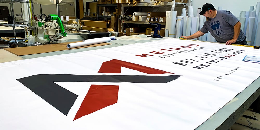
Vinyl is often preferred for outdoor banners due to its weather resistance and durability. Mesh fabrics are ideal for windy conditions, allowing air to pass through the banner.
For both indoor and outdoor banners, it’s important to consider the weight of the material if the banner needs to be moved or transported frequently (especially for trade shows or multiple event use).
Color Consistency and Accuracy in Large-Format Printing
Since large-format prints are produced on various materials such as vinyl, fabric, acrylic, and metal, it’s important to understand that each material absorbs and reflects ink differently and can influence how colors appear once printed.
Color management systems and calibration tools ensure that the colors you design match the output of the materials used. For example, implementing ICC (International Color Consortium) profiles helps manage color fidelity across printing devices and materials. These profiles provide a standardized format for describing the color attributes of a particular device in a specific printing condition, ensuring color consistency and predictability.
Further, the conditions under which large-format prints are viewed can also affect color perception. Outdoor signage is subject to natural lighting conditions, whereas indoor signage is often viewed under fluorescent lighting, which can significantly impact how colors are perceived.
These considerations, combined with those mentioned previously in this article, often require meticulous attention to detail during the entire printing process, from design and material selection to final placement and viewing conditions.
Large-Format Printing Solutions by Artisan Colour
The effectiveness of any large-format print project comes down to careful planning and expert execution, and Artisan Colour excels in both.
Whether adjusting for legibility at varying distances or choosing materials that bring colors to life, our team ensures every detail is perfect.
Contact our team of experts today to get started on your next large-format printing project.


