Retail Displays: 10 Print & Visual Merchandising Best Practices

The materials, finishes, and consistency you choose for your retail displays shape everything from first impressions to long-term loyalty. Whether you’re working on a small-scale refresh or scaling operations across multiple locations, it’s often the details that drive success.
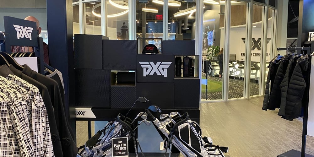
When Parsons Xtreme Golf (PXG) launched its 18 Ways to Give More Than Golf holiday campaign, every printed element was meticulously designed for impact. From hangtags to wall graphics, nothing was overlooked.
The 18 Ways to Give More Than Golf campaign was a huge success for PXG and offers valuable insights for retailers looking to score a hole-in-one with display, print, and visual merchandising.
Here are 10 best practices to consider for your next retail display campaign.
1. Large-Format Graphics: Prioritize Placement
PXG made a bold impact with oversized graphics, yet what made the execution exceptional was their intentional placement. These visuals weren’t positioned randomly—they anchored customer attention in key areas, such as primary product zones and entry points.
Tip: Consider designing large-format graphics as a strategic tool. Don’t clutter the space with oversized visuals; instead, use them sparingly to frame areas of interest or drive foot traffic toward a specific area. Focus on entrances, high-margin product displays, or wayfinding zones.
2. Retail Displays Should Be Functional, Not Filler
 Every PXG display was there for a reason: to guide customer traffic. Each visual directed the shopper’s attention and subtly influenced their journey throughout the store.
Tip: Treat your retail or commercial displays like directional arrows. Align signage and displays with your customer flow plans, whether it’s toward promotions, checkout counters, or premium products. When executed with artistry and strategy, customers feel naturally guided rather than overwhelmed.
3. High-Touch Materials Deserve Soulful Attention
 PXG poured extra care into its product tags because these were among the few materials customers would physically interact with. Incorporating high-quality finishes enhancing touch and visual attraction helps to draw customers' attention. This can be accomplished through paper selection, using metallic inks, and or laminating the printed product with finishes that feel unique in the hand.
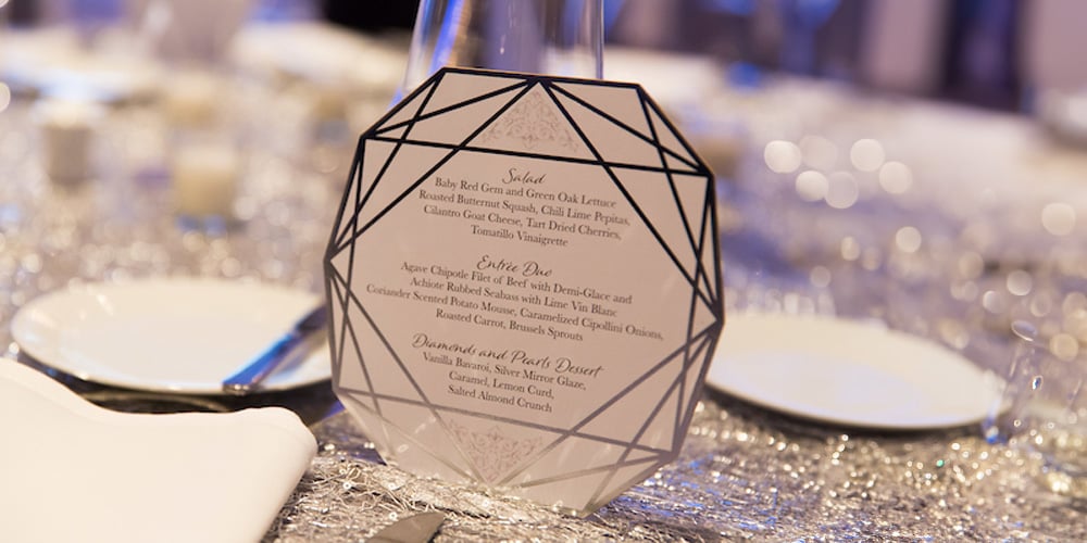
Tip: Customers don’t touch everything in a store, but the materials they handle—tags, packaging, menus, or brochures—represent your brand up close.
Invest in premium materials and finishes for these hands-on items to showcase the quality of your brand and products.
4. UV Finishing Solves Low-Contrast Challenges
PXG’s black-on-black branding is visually striking but complicated to print colors accurately since subtle details can easily disappear. To augment the color fidelity we used UV printing to add texture and gloss to specific elements on matte black surfaces, resulting in a clean yet high-contrast design that stayed true to the brand.
Tip: For low-contrast or monochromatic designs, use UV printing or spot gloss finishes to add depth and highlight key elements.
5. Test Prototypes In-Store
Before committing to large-scale production, PXG tested display prototypes in real store environments. They foreshadowed visual issues like excessive glare from overhead lighting and awkward placement early in the process, saving both time and expense.


Tip: Whenever possible, test your designs where they’ll physically live. Evaluate factors like lighting, viewing angles, and customer interaction before greenlighting final production.
6. Use Visual Hierarchy to Spotlight Premium Products
Not all products deserve equal emphasis. PXG highlighted premium golf clubs with deliberate techniques like contrast, elevated displays, and strategic lighting. Surrounding visuals were toned down to avoid competing for attention.
Tip: Use layout, lighting, or elevation to give your flagship items the spotlight. For less critical displays, opt for subtler treatments that don’t overwhelm premium elements.
7. Use Texture Where It Matters
PXG focused on adding texture to materials customers physically engaged with, like hangtags and packaging. They kept larger visuals smooth and clean to avoid unnecessary distractions.
Tip: Reserve tactile finishes (soft-touch, embossing, etc.) for key customer interaction points, such as brochures, tags, or door signage. Keep large-format materials sleek and simple for balance.
8. Glossy Finishes Aren’t Always Ideal
Glossy materials added vibrancy to PXG’s visuals, but glare from in-store lighting sometimes made them hard to read. PXG resolved this by using matte or satin finishes in high-glare areas.
Tip: Audit the display environment when selecting finishes. Use matte or satin finishes in spaces with strong direct lighting and reserve gloss for areas with softer lighting where it enhances vibrancy.
9. Use Lightweight Materials for Seasonal or Temporary Displays
The right materials allow short-term displays to reflect premium quality without breaking the bank. For example, we used Infinity foam core board for PDX’s temporary displays due to its lightweight durability, flexibility, cost-effectiveness, and ease of use. Infinity foam board also features a proprietary digital-grade styrene surface that ensures excellent ink adhesion and high-quality, long-lasting prints.
Tip: Selecting the right material for temporary displays is crucial as it directly impacts the display's structural integrity, visual appeal, and functionality. The ideal material, such as Infinity foam board, should offer a balance of durability, print quality, and versatility to ensure the display maintains its effectiveness throughout its intended use period.
10. Centralized Production Eliminates Inconsistencies
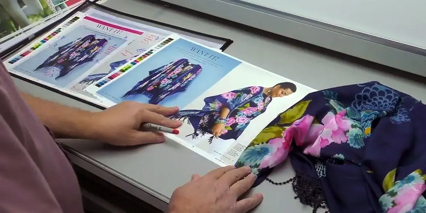
PXG achieved flawless color consistency across all six locations by centralizing production with a single vendor. This ensured hangtags, wall graphics, and signage all matched in color, tone, and finish.
Tip: Multiple print vendors often lead to variations in materials and colors, which can erode customer trust. Standardize your printing process with one experienced printing partner to maintain uniform branding at scale.
About Artisan Colour
For over 26 years, Artisan Colour has been a leader in commercial printing, delivering the artisanal quality and precision that modern businesses demand. We combine the craftsmanship of master printers with cutting-edge technology to help businesses like PGX Golf transform their spaces.
Beyond our expertise in printing and retail displays, we offer a comprehensive suite of solutions, including:
- Digital Printing: Marketing collateral, catalogs, branded packaging, vehicle wraps, personalized printing, and specialty printing.
- Signage and Branding: Business signage, trade shows and events, and wall wraps.
- Direct Mail Marketing: Direct mail campaigns, personalized direct mail, mailing lists, Informed Delivery, and integrated digital solutions.
- Marketing Fulfillment: Web-to-print, warehousing and storage, inventory management, kitting and assembly, and promotional products.
- Digital Services: Prepress, premedia, online image libraries, photography, graphic design, image retouching, and color management.
- Digital Marketing: Digital marketing strategy, graphic design, website design, content marketing, SEO, social media, software integrations, and Hubspot ecosystem management.
Contact our team of artisans today to learn more about the Artisan Colour difference.


